Buttons on User Input Screens are implemented to direct users to the next step. Buttons that are commonly used in screens are Save, Cancel, Back, Send, or Edit. As a template creator, buttons helps with the logic design and connect a screen with different steps.
How to add Buttons to a Screen
-
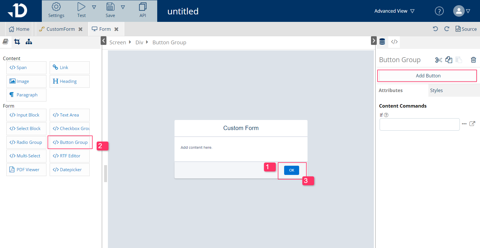
Place the cursor to where the new buttons should be
-
Select
Button Groupfrom the left side panel -
A new button group is added. In the
Button Groupelement, more buttons can be added by using "Add Button" option on the right side-panel.
How to Configure a Button
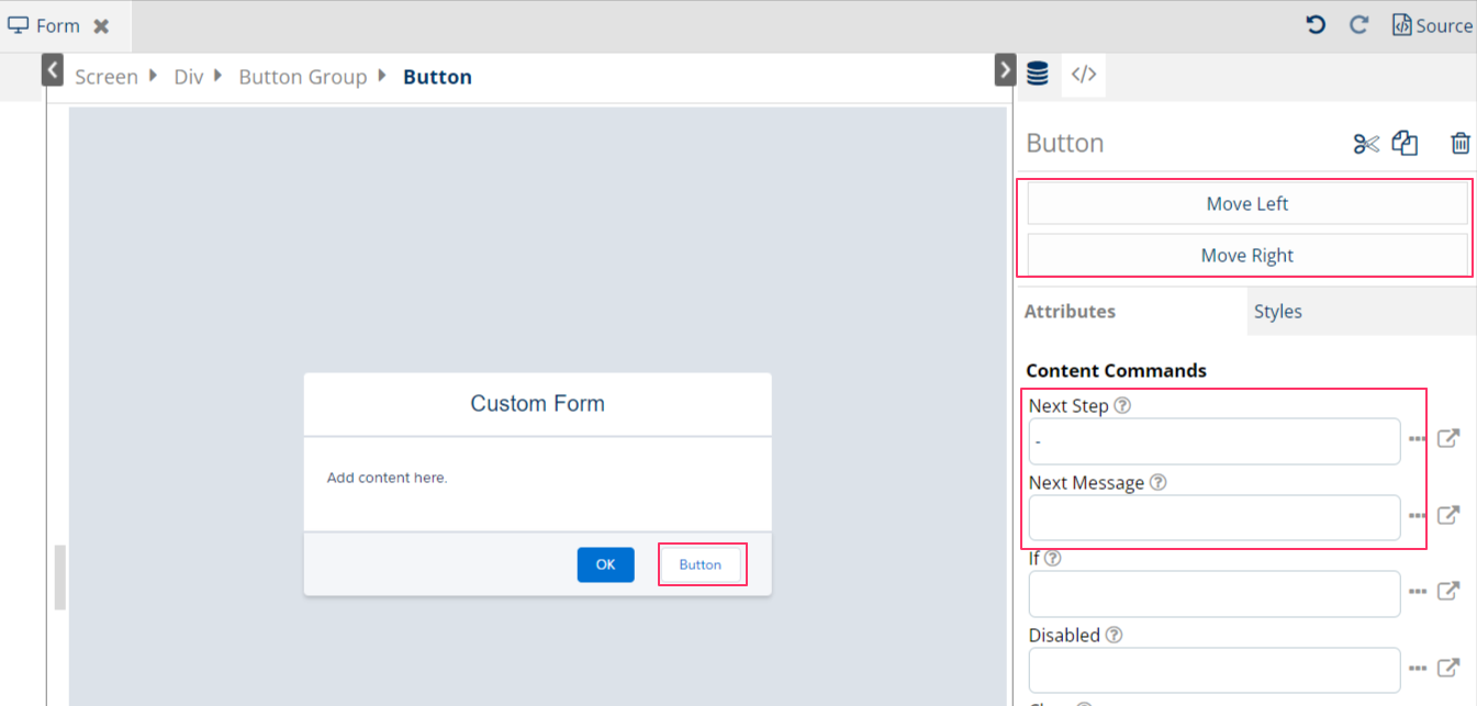
To configure a button inside the Button Group, choose the button in the screen edit view:
-
Move Left/Right: move the button to the far left or right of the next buttons.
-
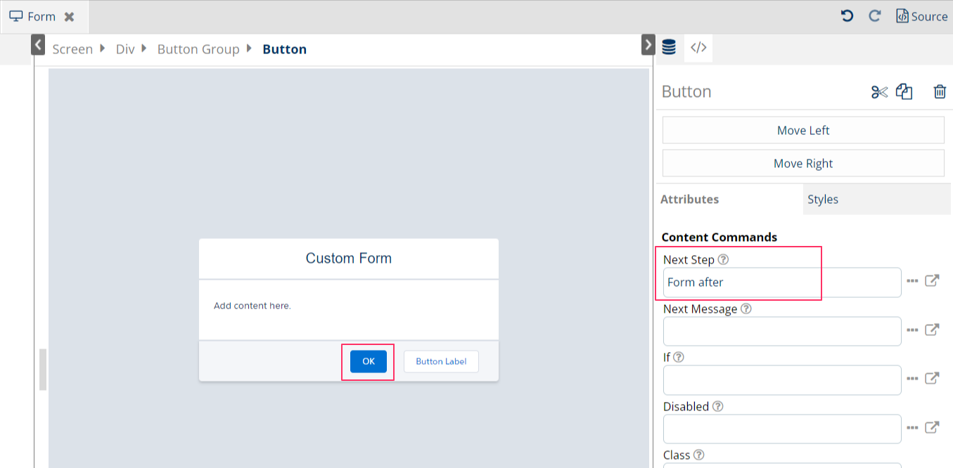
Next Step: Name of the step in the same segment that this button should direct users to
-
Next Message: short text message while loading and redirecting to next step (for example, Saving document, Loading, Redirecting, …)
-
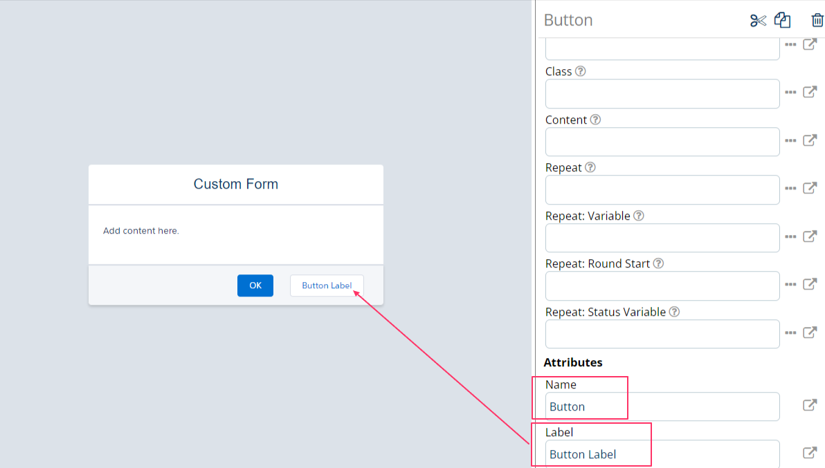
Name: is the variable name of the button which can be used later in the Flow to make conditions, for example, “
param.button == Button" to help identify which buttons users have clicked from the previous screen. -
Label: the text to display in the button to direct users where to click.
Use cases
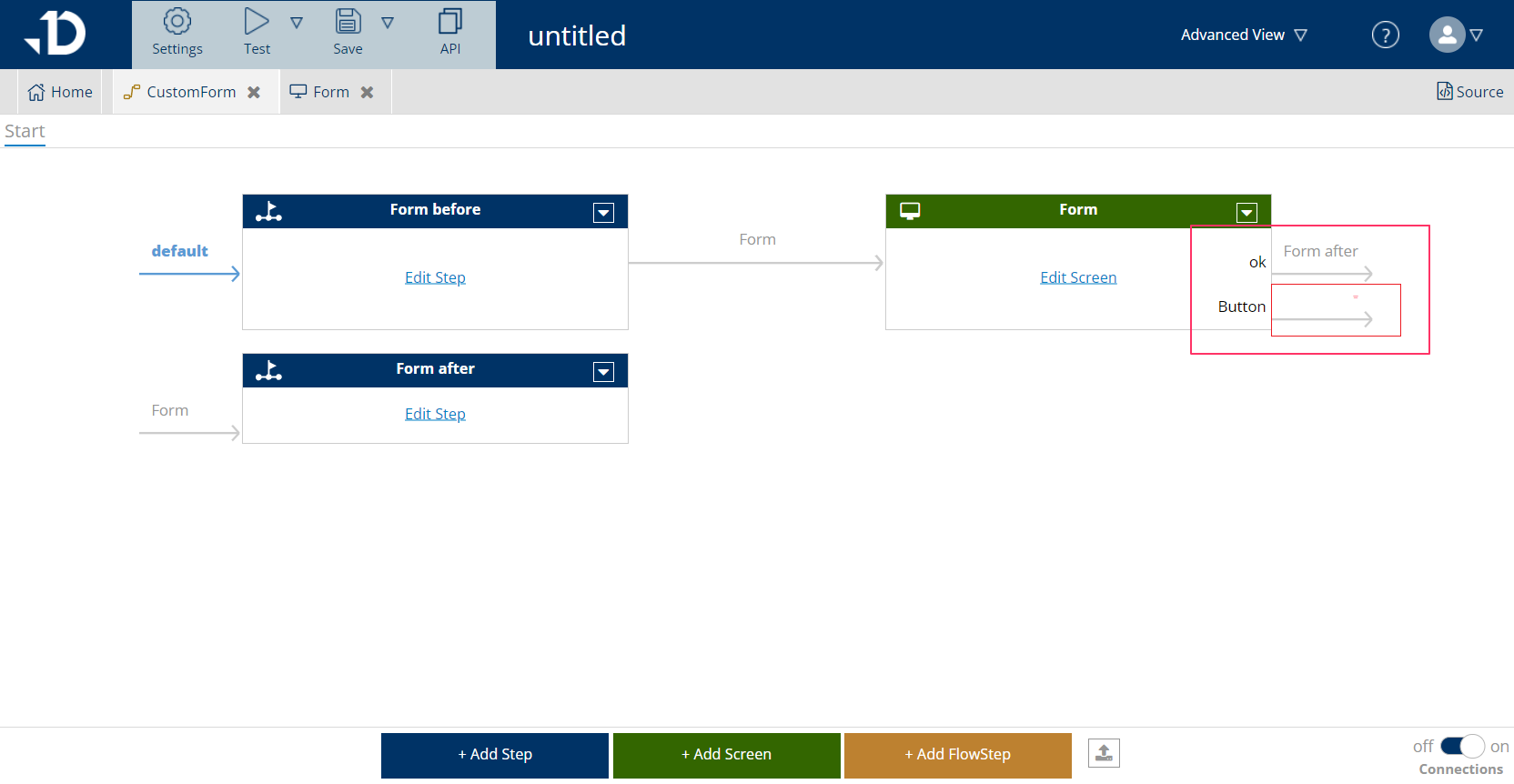
Buttons are used frequently in screens as it helps users to exit from one screen to another or navigation. It helps connect multiple steps and provide interaction for users. For example, in the Custom Form subflow within the default template, the OK button has been connected to Form After steps to exit the subflow and go back to Main flow
It is also possible to connect steps and screen from Flow view. Button Name is visible from Flow view for template designers to identify which button connects to which step.