In User Input Screens or any HTML form, a checkbox is a form control that allows users to select or deselect a particular option. It is represented by the <input> element with the type attribute set to "checkbox." Checkboxes are used when you want users to make one or more selections from a list of options.
Here are some common use cases for checkboxes within Dynamo Template :
-
Multiple Choices: When users can choose multiple options from a list. For example, selecting multiple content clauses to populate in the document.
-
Yes/No: When users want to populate or not a certain content in the document, for example, an image, or merge an attachment or display discount in pricing table.
Insert checkbox to screen
After clicking on Edit Screen or creating a new screen (or form). To add checkbox inside the container,
-
Put cursor inside the container
-
Click on
</> Checkbox Groupon the left sidebar -
A checkbox group with a checkbox button will appear inside the container.
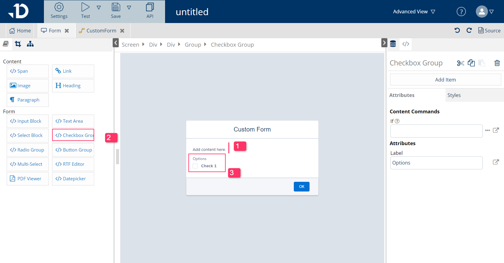
Set up Checkbox
Each of the <checkbox> element will have its own set of attribute, including Name and Label. On checkbox group level, only label, which reflects directly onto the screen, can be set.
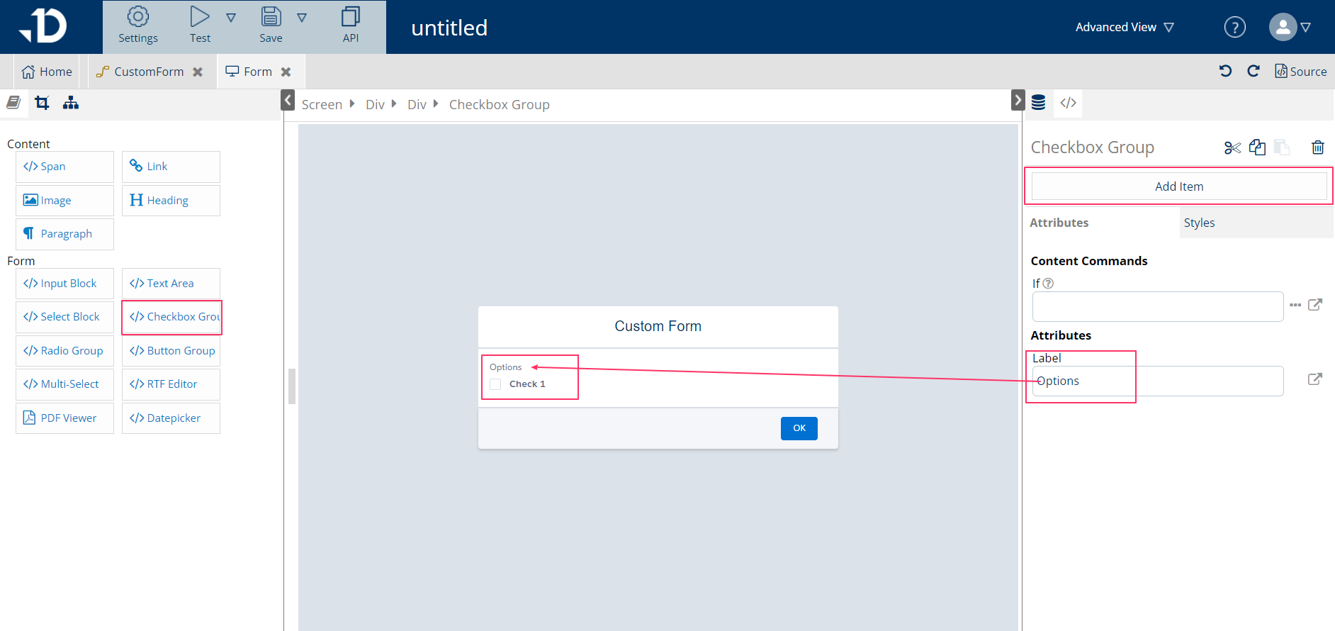
For Checkbox Group element:
-
Select the
Checkbox Groupon the breadcrumb -
On the right pane, enter values for
Labelin the Attributes section.-
Labelis the text that displays above the checkbox buttons, giving more details about the checkbox selection for end users. Label can be left empty if not needed.
-
-
More Checkbox elements can be added with
Add Itemalso on this group element.
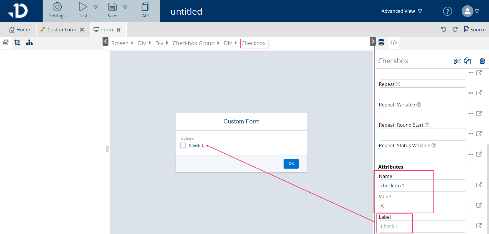
For Checkbox element:
-
Click on each checkbox button and then click on the
Checkboxelement on the breadcrumb -
On the right pane, enter values for
Name,ValueandLabelin the Attributes section:-
Nameis the variable that will hold the value when end user selects. For example, when users check this checkbox, the Flow will understand thatcheckbox1=A. This attribute should not be empty. -
Valueis the value that the checkbox holds. This attribute can be left empty, then the value will be resolves into Boolean value. For example,checkbox1=truewhen this checkbox is checked -
Labelis the display text on screen. This attribute should not be empty.
-
Adding/removing checkbox options:
-
Adding additional checkbox can be done by: select the Checkbox Group element on the breadcrumb > Click on 'Add item' on the top of the right pane
-
Removing checkbox can be done by: select the Checkbox element on the breadcrumb > Click on the trash can icon on the top of the right pane.