A radio button is a graphical control element in user input screens that allows users to choose one option from a set of mutually exclusive options. Radio buttons typically appear as small circles or round buttons, and they are often used in groups where only one option can be selected at a time. When a user selects one radio button within a group, it automatically deselects any other radio buttons in the same group. This behavior ensures that only one option is chosen from the set.
Here are some common use cases for radio buttons:
-
Document language selection: Select a document language to generate (English, Finnish, Germans, Dutch, etc.)
-
Document settings with more than 2 options: such as select a payment method (Net15, Net30 or Net45), select to display with or without discount of product list, product options, or select to display full Contact Name or just initials or only First Name, etc.
Insert radio buttons to the screen
After clicking on Edit Screen or creating a new screen (or form). To add radio buttons inside the container, please continue with the following steps:
-
Put cursor onto where the Radio Button should be added
-
Click on
</> Radio Groupon the left sidebar -
A radio group with 2 radio buttons will appear inside the container.
Set up Radio Buttons
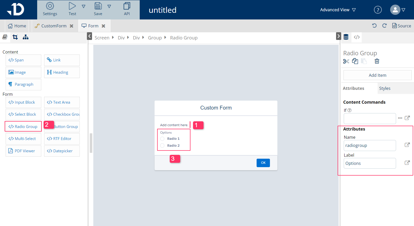
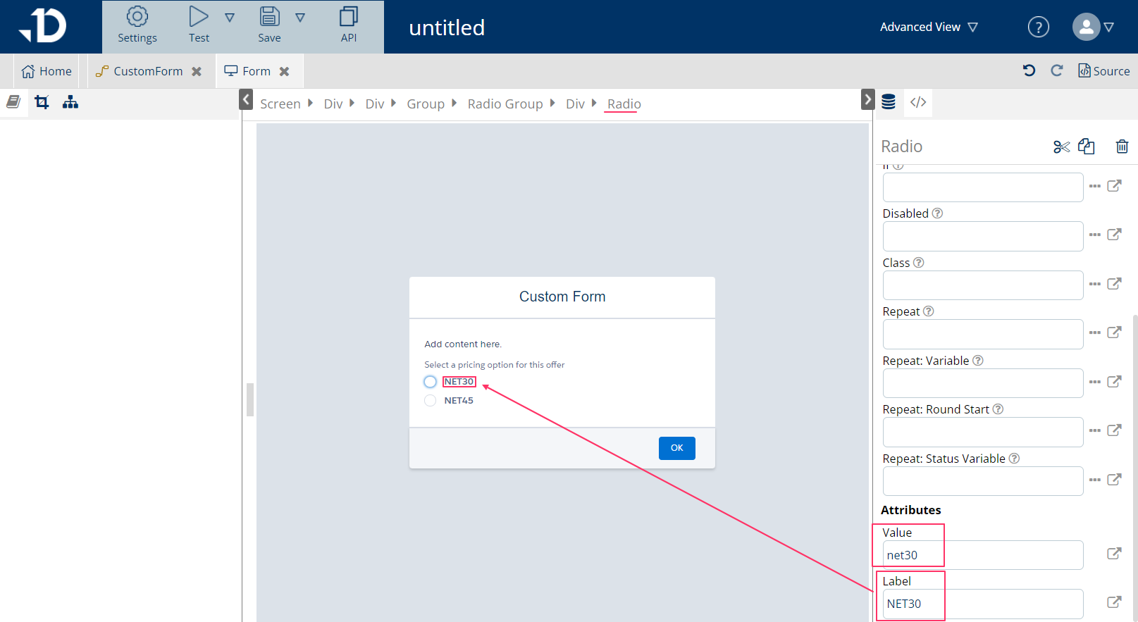
In order for radio buttons to work in a template logic, the template designer needs to enter values in the Attributes section on the right pane for Radio Group element and Radio element. The element can be accessed using breadcrumb like in Document edit view.
For Radio Group element:
-
Select the
Radio Groupon the breadcrumb -
On the right pane, enter values for
NameandLabelin the Attributes section.-
Nameshould be the variable that will hold the value that the end user selects. In the example below, the variable is set to selectedPricing, which holds the pricing option that the end user will choose later. The variables, created in screens after the user has picked its value, can be used later steps in the logic flow. -
Labelis the text that displays above the radio buttons, giving more details about the radio selection for end users. Label can be left empty if not needed.
-
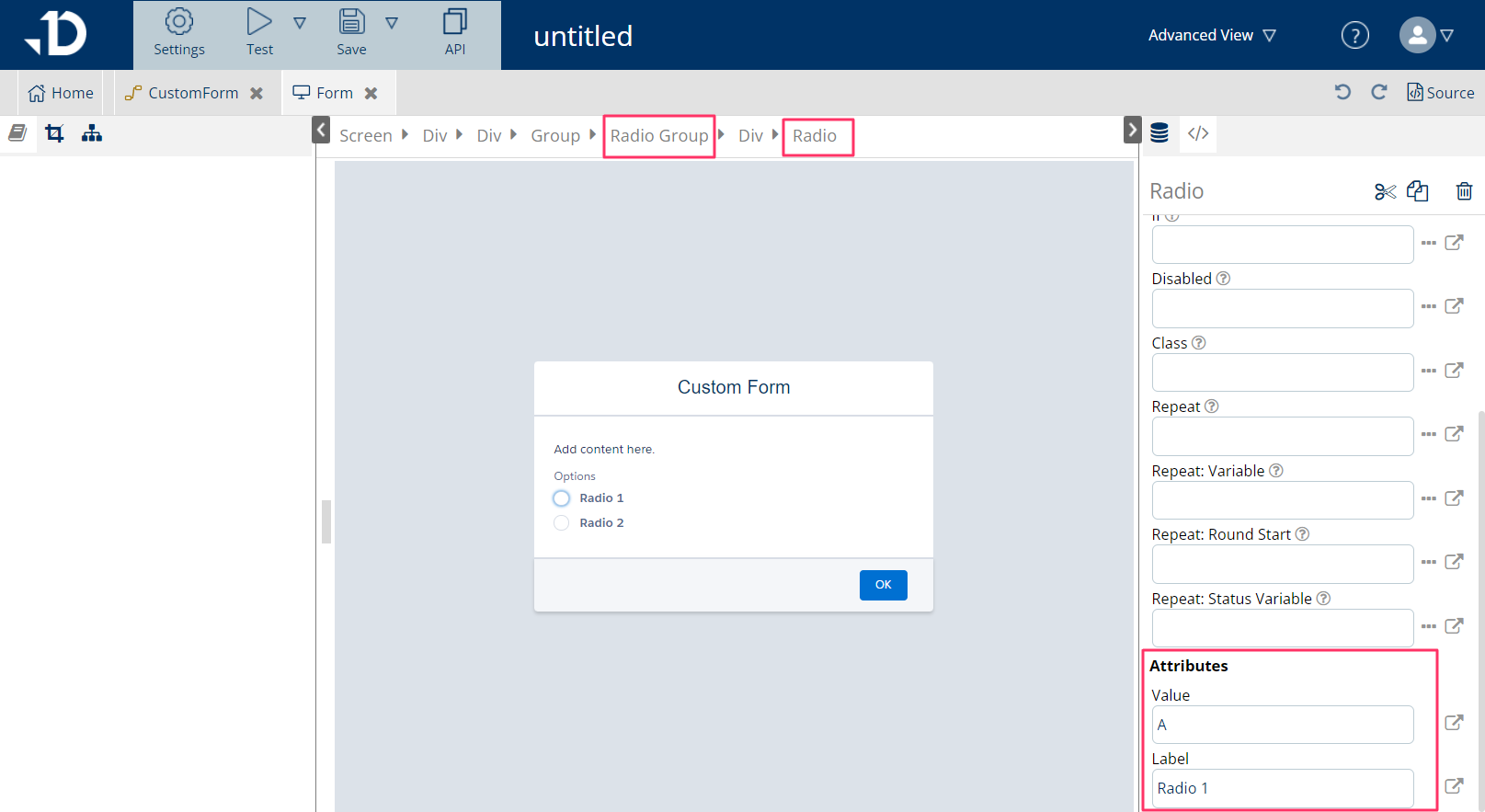
For Radio element:
-
Click on each radio button and then click on the 'Radio' element on the breadcrumb
-
On the right pane, enter values for
ValueandLabelin the Attributes section:-
Valueis the value that the radio button holds. In this example, there are 2 radio button options, whose values are ‘NET30' and 'NET45’. Whichever button the end user clicks on, the value of the selected button will become the value of the variable selectedPricing that has been declared earlier in the Radio Group. -
Labelis the placeholder text for each radio button. This attribute should not be empty.
-
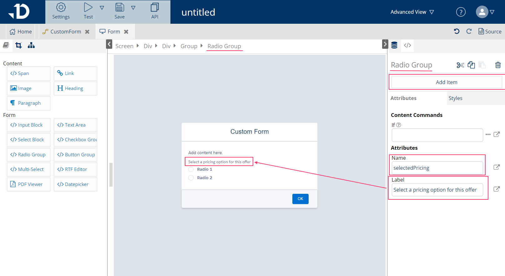
Adding/removing radio options:
-
Adding additional radio buttons can be done by: select the Radio Group element on the breadcrumb > Click on 'Add item' on the top of the right pane
-
Removing radio buttons can be done by: select the Radio element on the breadcrumb > Click on the trash can icon on the top of the right pane.
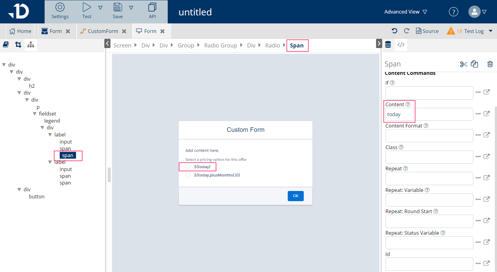
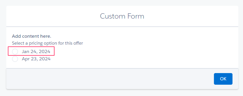
Radio buttons with dynamic labels
The radio button can also get its label dynamically from a variable. In the example below, the first radio button's label needs to show the current date to the end user.
Steps to add dynamic content to radio button's label:
-
Follow the instructions described in 'Set up Radio Buttons' section to set up the radio button.
-
Click on the radio button, then select the second 'Span' element in the tree view under
label. Each label indicates an option in that input group -
On the right pane, add the wanted variable to the 'Content' attribute in the Dynamic Attributes section. To display the current date, the variable
todaywas used for the example. The 'Span' element will become bold and dark blue, indicating that there's dynamic content behind.