There are two types of text input that can be added to User Input Screen: Input Block (short text or single line) and Text Area (multiple line texts). Depending on what information needs to be retrieved, a respective input block can be used.
Input Block
In user input screens or forms, an "input text" refers to a form control that allows users to input a single line of text. It is commonly used to collect textual information from users, such as names, addresses, or any other short pieces of text.
The HTML <input> element is used to create an input text field. In Screen edit, select Input Block to add to the screen.
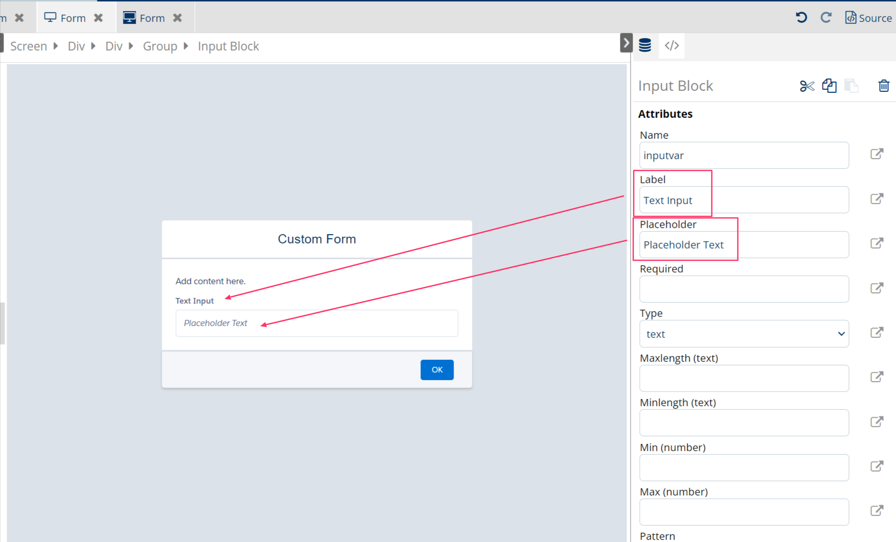
Configuring the Input Block using the following main attributes:
-
Name: define the variable name that later holds the input value
-
Label: text appears on top left of the box that users can see to understand which information they should input there
-
Placeholder: is the placeholder text appears inside the box which will instantly disappear when the box is chosen or text is entered. This is used to instruct the user what to type there.
For other attributes:
-
Required: can either have boolean value
trueorfalse, or a dynamic content which resolved into a boolean value -
Type: different types of input block can be selected to format the data user can input (date, email, month, number, range, tel, text, time, week)
-
Maxlength (text): if
textis defined in Type, maximum number of characters required when enter (for example, enter "10" in here meaning users cannot have more than 10 characters in the input block when inputting) -
Minlength (text): if
textis defined in Type, minimum number of characters required when enter (for example, enter “2” in here meaning users need to have at least 2 characters in the input block otherwise it will resolve into error) -
Min (number): if
numberis defined in Type, giving the minimum number here so that users cannot enter any number below it -
Max (number): if
numberis defined in Type, giving the maximum number here so that users cannot enter any number above it
Text Area
A Textarea in a user input screen or in an HTML form is a form control that allows users to input multiple lines of text. It's commonly used when it requires users to provide more extensive or multiline textual information, such as comments, messages, or a description.
Same as Input Block, the attributes for Text Area contains Label, Name and Placeholder text configuration.
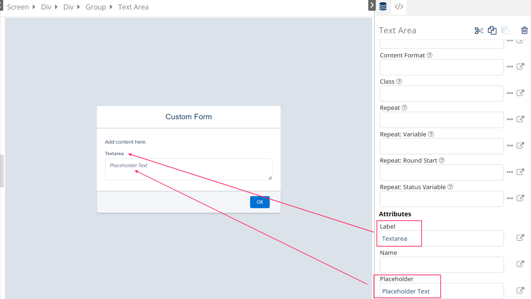
Configuring the Textarea using the following main attributes:
-
Name: define the variable name that later holds the input value
-
Label: text appears on top left of the box that users can see to understand which information they should input there
-
Placeholder: is the placeholder text appears inside the box which will instantly disappear when the box is chosen or text is entered. This is usually to instruct the user what to type in.