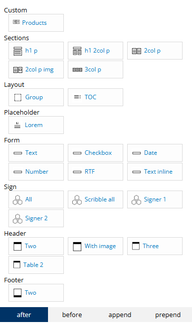
Components contains ready-made layouts that can be added instantly to the content.
These components will adapt to the current styles and are responsive to the web page view.
Components can be accessed from the left side panel, next to the Formats tab.

Sections
Create a new section with different layouts. To quickly divide the document into 2 or 3 columns, the component can be used as its style is already responsive to web view and authors just need to insert text.
Layout
Group: Instantly create a group (div) element that can be used later to enable editing.
TOC: Add a Table of Content. The Table of Content will retrieve all the texts that are assigned as Headings and display them in a table. These also get indexed, allowing users to navigate in the PDF output to where the headings are.
Placeholder
Instantly add sample text, which can be edited later to match the content with the whole document.
Form
These are Form elements to allow users to insert texts or select options in the document. These are mostly used with the Engage/Automate use case where the document is shared and viewed as an HTML template, allowing internal or external users to interact with the documents. Basic form elements are listed here: text, checkbox, date, number, rich text field, and inline text.
Sign
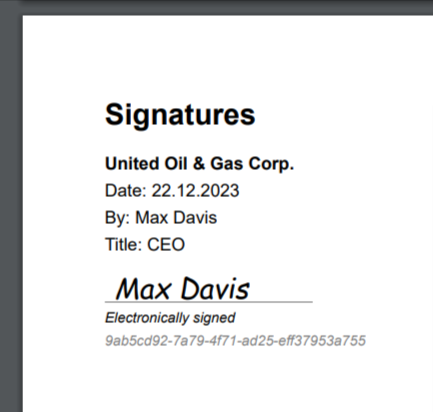
The components contained in this section are only relevant when using the E-signing external workflow. These helps customize the Signature page or box. By default, the signature boxes contain basic information of the signers. With this component, authors can add more texts, for example, custom fields or rearrange the lines, or translate to another language.

If the setting Require Scribble is enabled, the Scribble all component should be used, otherwise the components All, Signer 1 or Signer 2 can be used.
If a sign component is not added to the document, one will automatically be added as a separate last page to the generated document.
Header
These components can be used to quickly create the correct layout for the header that is responsive in web view and contains global styles
Footer
These components can be used to quickly create the correct layout for the footer that is responsive in web view and contains global styles.
