Although we have this Date Picker component with pop up calendar, it is recommended to use <input> which is more technically stable and has far more configurations.
Date picker is a date selector for user to easily choose a date. It will show a pop-up calendar window for users to pick a date. The date gets selected will be stored in a variable that can be used later in the Flow. Common use cases of selecting a date are:
-
Choosing a starting point
-
A document validity date of the document
-
Filter out list of line items that has specified date
How to add Date Picker to Screen
-
Place the cursor to where the Date Picker should be
-
Select Datepicker from the component list on the left panel
-
Datepicker element will be added instantly, showing a list of configurations on the right
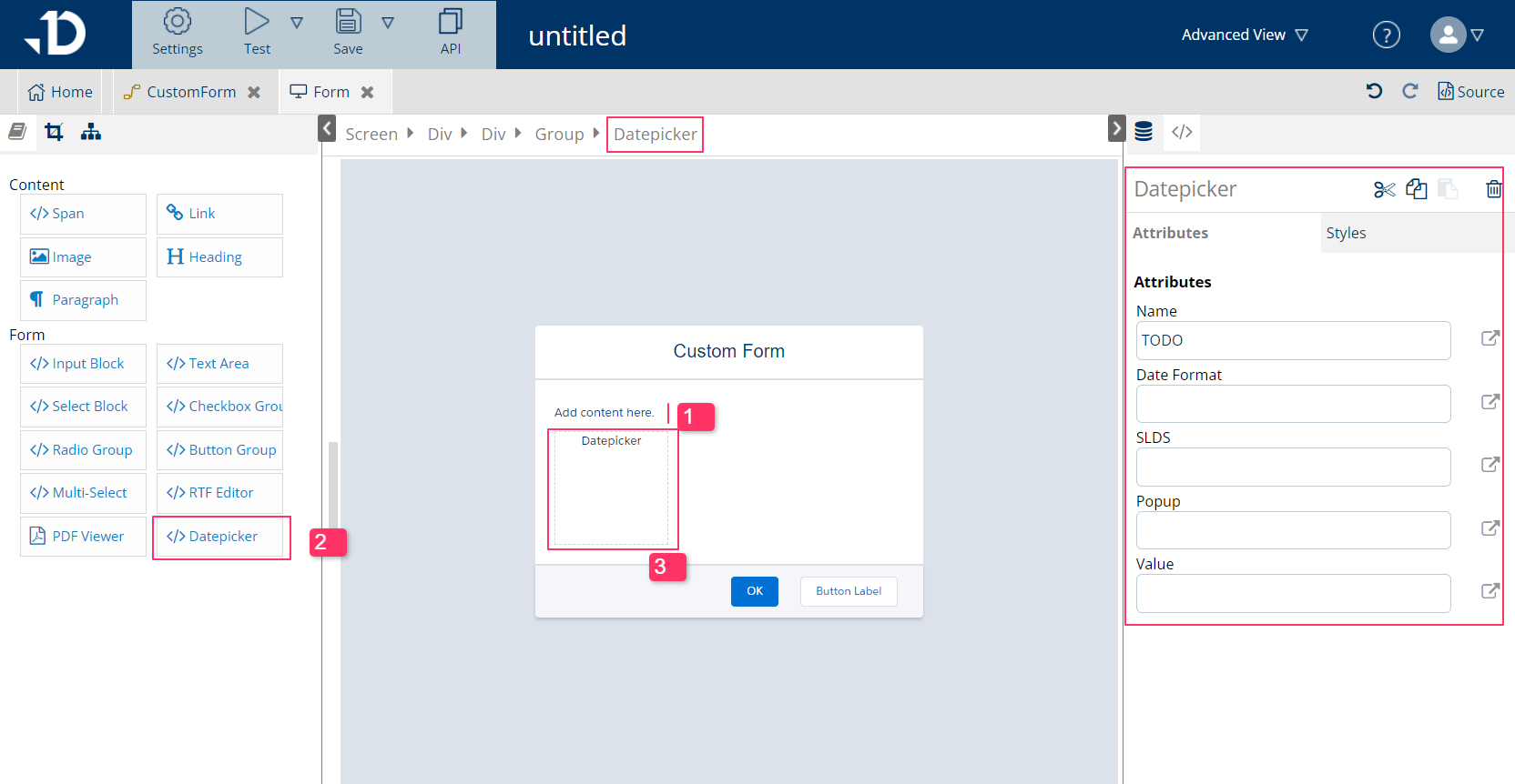
How to configure Date Picker
Attribute list:
-
Name: variable name holds the date value. This attribute should not be empty.
-
Date Format: choose from set of format in the flow, can be left empty
-
SLDS: Salesforce Lightning Design System, if true, will follow this theme in looks and functionality. This attribute is not required.
-
Popup: If true, the produced date is an input element, which, when clicked, opens up the calendar to choose. Otherwise, it appears as a block element.
You can read more from datePicker command.