The Select Block component or <select> element is often used within screen input to allow users to choose from a list of options. It is also called as “Pick List”. It can contains one or more <option> elements, each representing an item in the list. This input method is suitable for situations where there's a limited and predefined set of options ensuring that the user selects a valid choice from that set.
Select lists are favored over radio buttons in HTML forms for single-option selection from a larger set of choices, especially when space efficiency is crucial. They provide a compact and organized presentation, taking up less screen space and maintaining a clean appearance. Select lists are particularly useful when dealing with a substantial number of options and when a default or placeholder option is needed to prompt user interaction. Their ease of styling and customization further enhances their versatility, making them a preferred choice for achieving a consistent and visually appealing form design.
Insert Pick List or Select Block to Screen
After clicking on Edit Screen or creating a new screen (or form). To add pick list inside the container:
-
Put cursor onto where the Pick List should be added
-
Click on
</> Select Blockon the left sidebar -
A pick list with 3 options will appear inside the container.
Setup Select Block
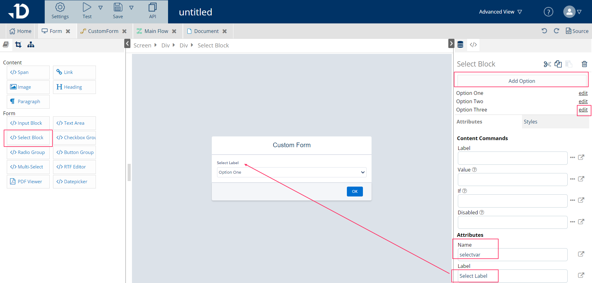
Select Block element
On the Select Block element, it’s possible to:
-
Add more options by clicking on Add Option button
-
Modify option by clicking edit of that option
-
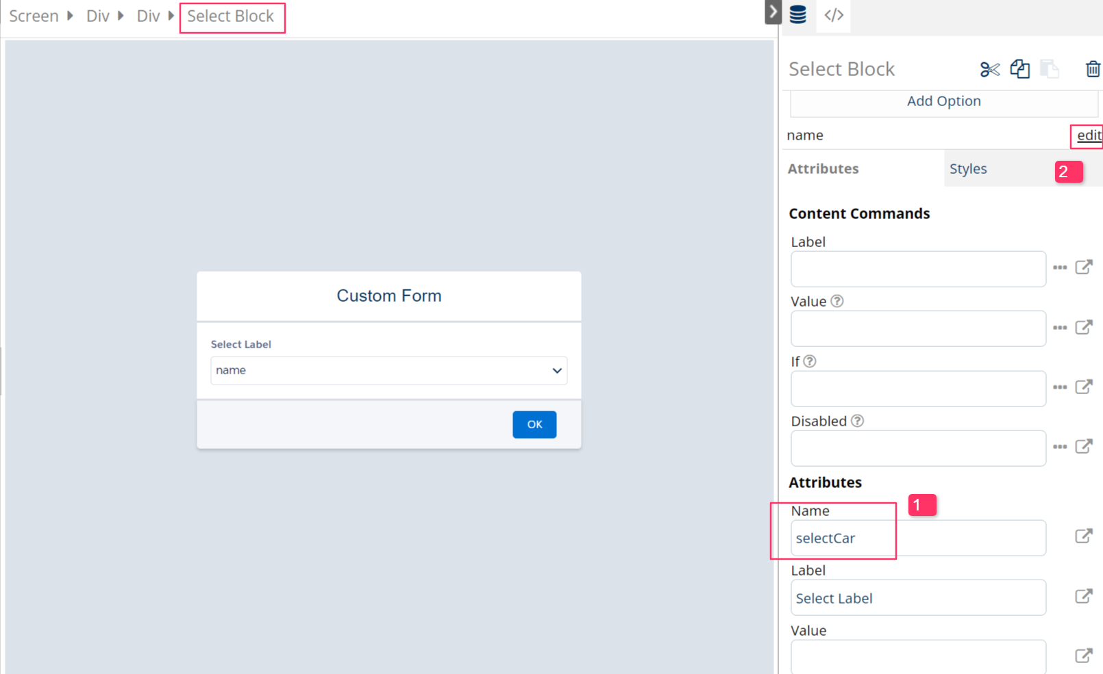
Modify attributes like Name and Label to explain what the pick-list is about
-
Name: variable name of that Select Block. After setting a variable, the value of the variable will depends on the value of the option, whichever option have been chosen.
-
Label: input content for instruction or label the Select Block, to guide users what to choose here
-
Modifying option list can be done one by one, clicking on edit of that option. Then <option> element is selected.
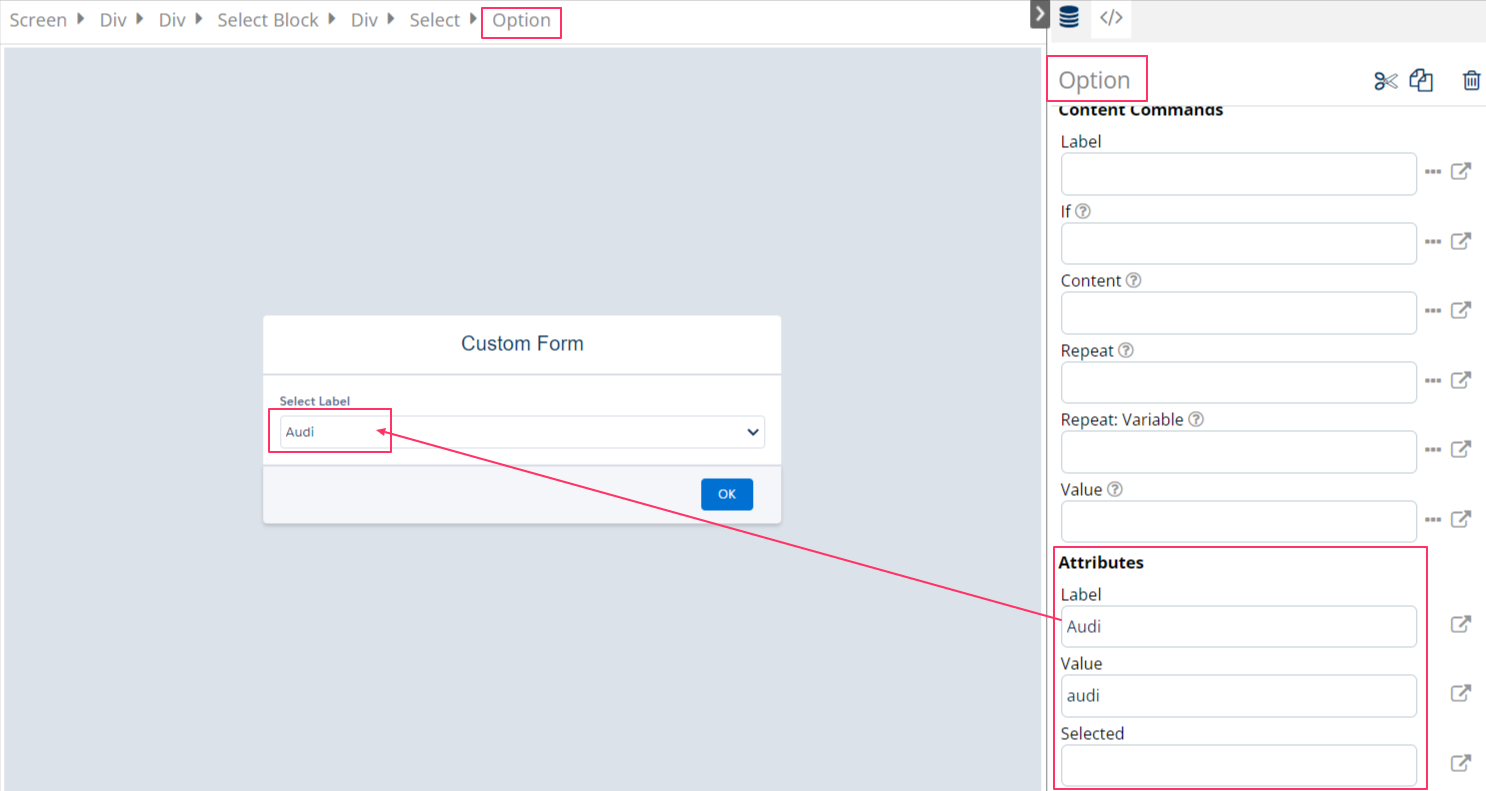
Option element
-
Label: display name of the value and reflect instantly on screen for users to see
-
Value: a short and memorable text to use later in the flow, if the option is selected by users, it will be understood that “selectVar=audi”. This is case-sensitive.
-
Selected: can be pre-defined with "true" or "false". If true, this Select Block will automatically select ‘Audi’
Adding/removing listed options:
-
Adding additional options can be done on the Select Block element from the breadcrumb > Click on 'Add option' on the top of the right pane
-
Removing options can be done by: select that Option element using edit > Click on the trash can icon on the top of the right pane.
Extensive use cases of Select Block
Populate dynamic content to Option:
As an example, if the template contains a collection of items, for example, list of optional Opportunity Product Items retrieved with relatedList called ‘cars’, as below:
|
List of items (cars) |
Name |
Id |
Optional__c |
|---|---|---|---|
|
Audi |
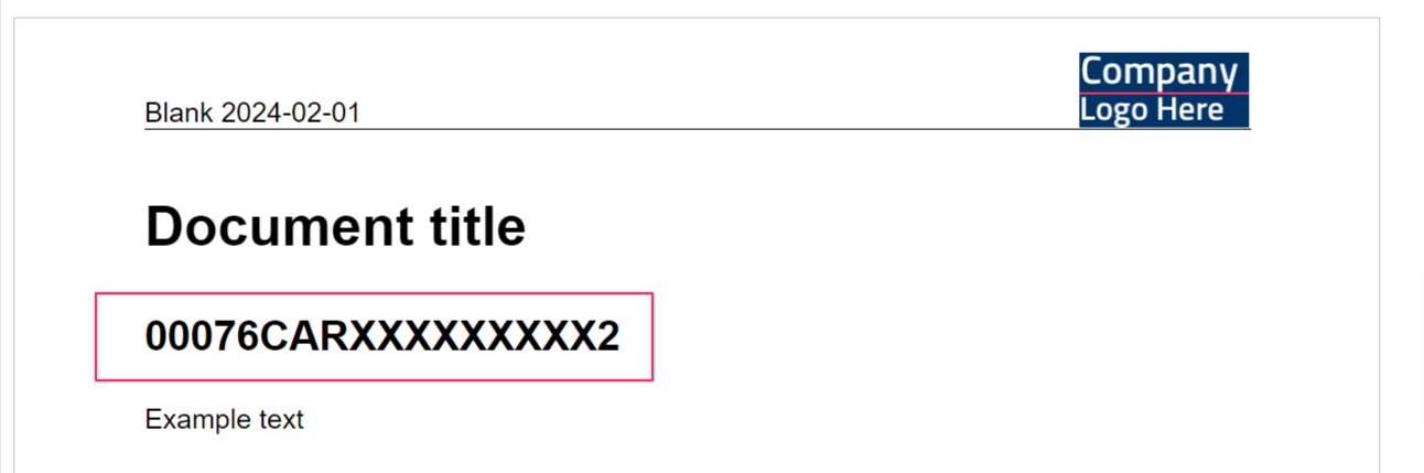
Audi Etron |
00076CARXXXXXXXXX1 |
true |
|
Tesla |
Tesla Model X |
00076CARXXXXXXXXX2 |
true |
|
Mercedes |
Mercedes EQS |
00076CARXXXXXXXXX3 |
true |
-
Follow the instructions described in 'Set up Select Block' section to set up a pick list.
-
Click on Edit of an Option to modify its attribute
-
To populate the above selections to the screen, Content Commands of the
<option>element are used
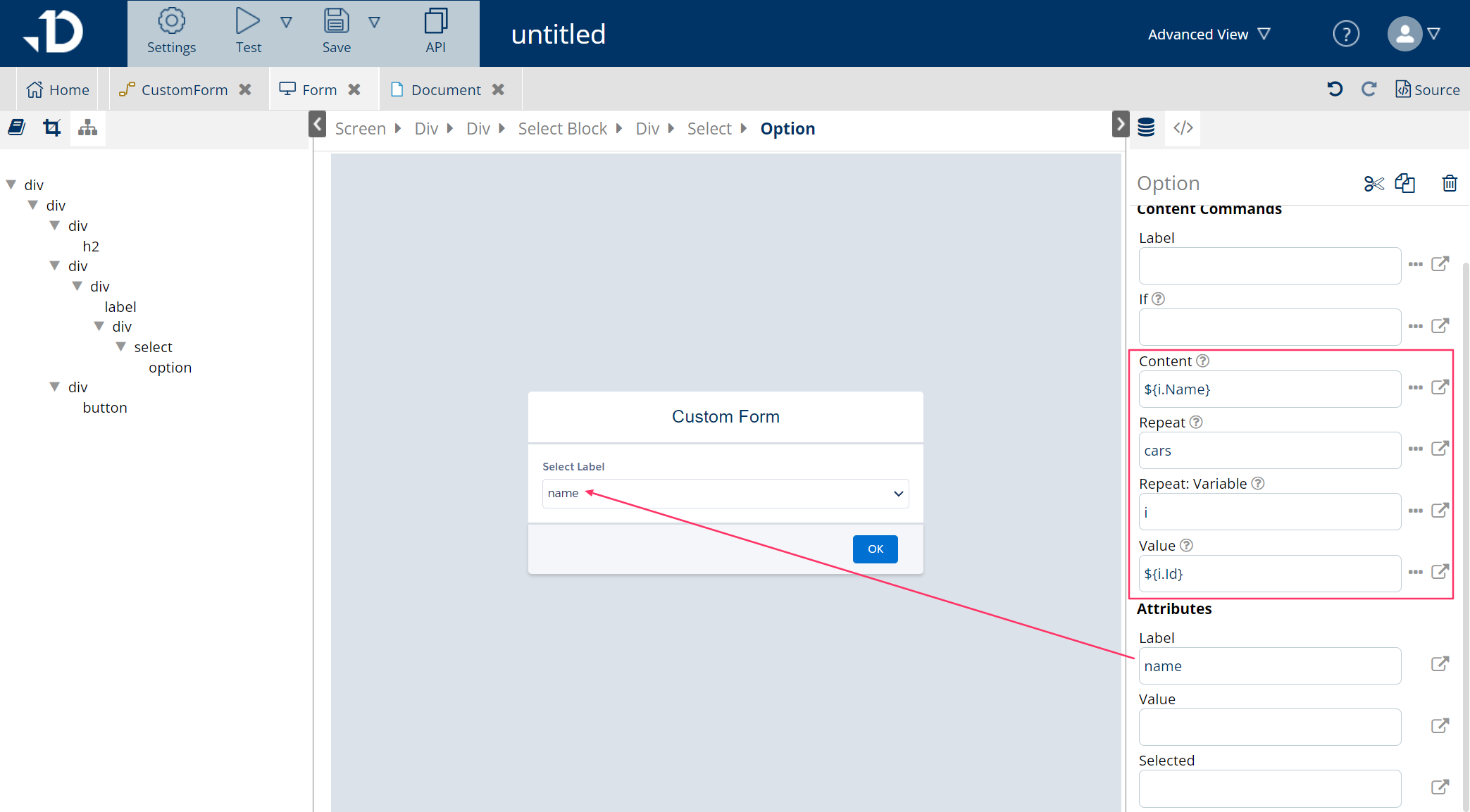
-
If Content attribute is used, it will overwrite the Label attribute below with dynamic content
-
Enter the collection name ‘cars’ in the Repeat attribute
-
Give Repeat:Variable any name, for example 'i' in this case
-
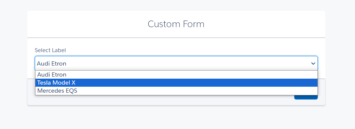
Provide dynamic content in Value attribute to populate the value of SelectBlock after users have selected it. For example, if users select ‘
Tesla Model X' in the screen, the template will resolveselectCar=00076CARXXXXXXXXX2
Test run the template will show the below screens