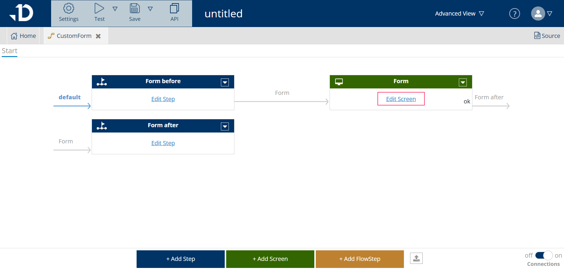
Editing a screen starts by clicking on Edit Screen on the green box in the logic flow.

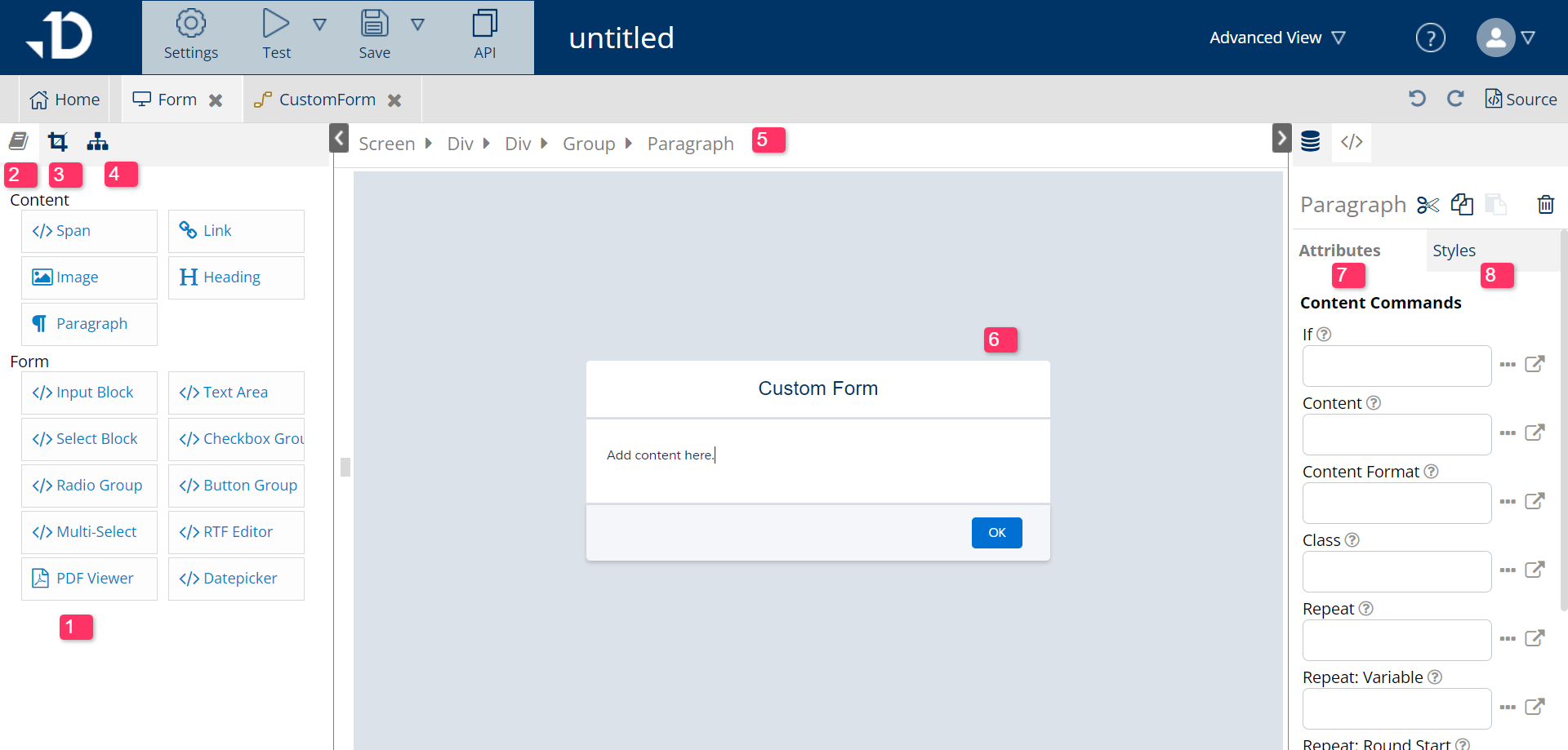
A new tab will open that has somewhat similar UI with Document Edit view.

-
Block Library view: contains all the elements to add to a form
-
Block Library button: to switch to content view
-
Style Editor: switch to style view, to format the font, color of the screen
-
Element Tree View: to view all the element break down and select element to edit
-
Element bar: to view all the element inside the selected element
-
Screen Editor View: all the changes to screen will appear here
-
Attribute of the selected element: modify the condition, value of the selected element
-
Style of the selected element: see the current style and apply new style
To add a content into the screen, first choose the place that the content should be by placing the cursor, then click on the content to choose. It will immediately appear inside the Screen view.

Elements of an Input Screen
Content
Span
Create a small span, to map with dynamic field or to create a specific style for selected texts
Link
Create a link that lead to a website for reference or a link to download the created PDF
Image
Add image like logos for branding
Heading
Create a heading to categorize
Paragraph
Insert a new plain text paragraph to explain or instruct users
Form
Input Block
Input text field that has one line. Usually used for update a field in Salesforce with new value or a PDF name change
Text Area
Input text field that holds multiple lines
Select Block
Pick-list to choose from pre-decided options. Used to choose the language, type of payment term,...
Checkbox Group
Checkbox allows users to choose multiple options or refuse some options to display for documents by checking/unchecking
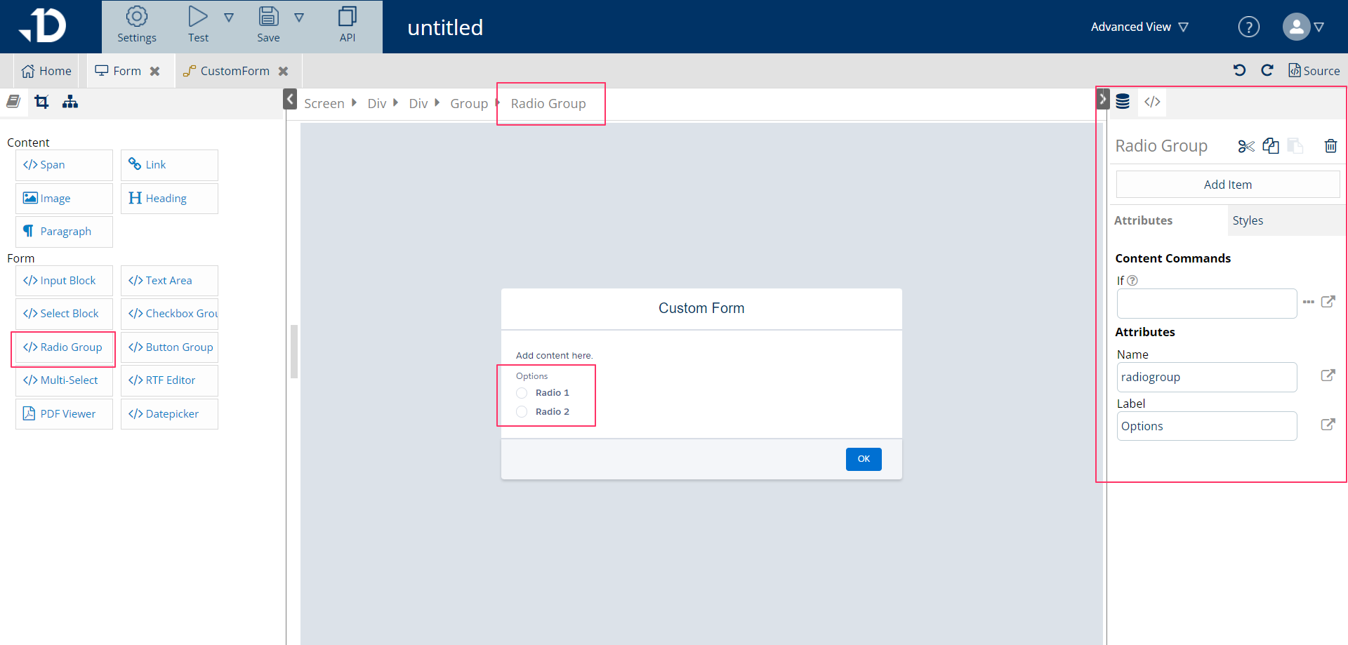
Radio Group
Radio buttons only allow the user to choose one option in a radio group. Deselect a radio button by choosing another option
Button Group
To connect or direct to a next action (step or screen) in the flow. Commonly used buttons are Save, OK, Back, Cancel, Edit, Send Email, etc.
Multi-Select
Choose multiple options at the same time and move it to selected column, which is commonly used for selecting attachments, selecting contacts for sending emails, ...
RTF Editor
A pre-made Editor view for Editing screen
PDF Viewer
A pre-made view for the composed PDF document view
Date Picker
A calendar to select date, usually to filter out an item from-to date or add a variable holding selected date to pin the expiration date
